TENFOLD
In this series, I focused on refinement, movement, repetition, flexibility and simplicity – which can have a ripple effect if they are all applied to our daily lives.
I chose paper because it’s a material that embodies these attributes. It requires a refining process to make pulp. It’s light, easily transportable and can be duplicated to the same size and colour. It’s flexible in that it can transform into something new, like a painting, a cup, a book, cash, etc., and can upcycle something else into a new form. For example, the kind I used is from off-cut white cotton T-shirts. A basic that most of us have.
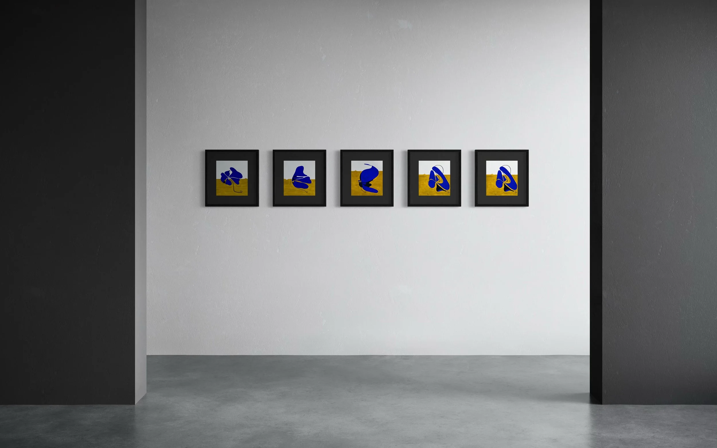
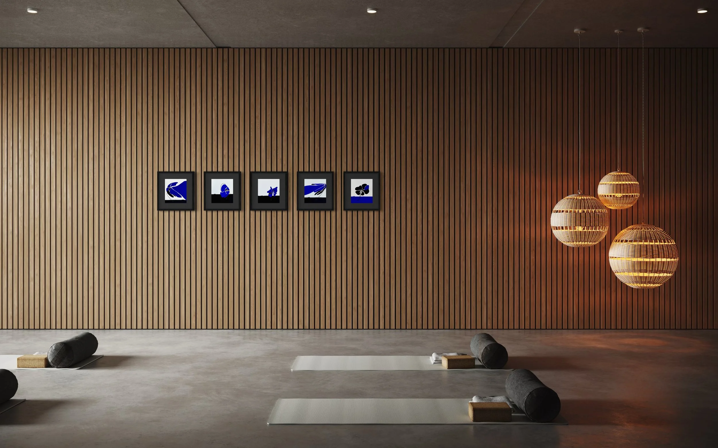
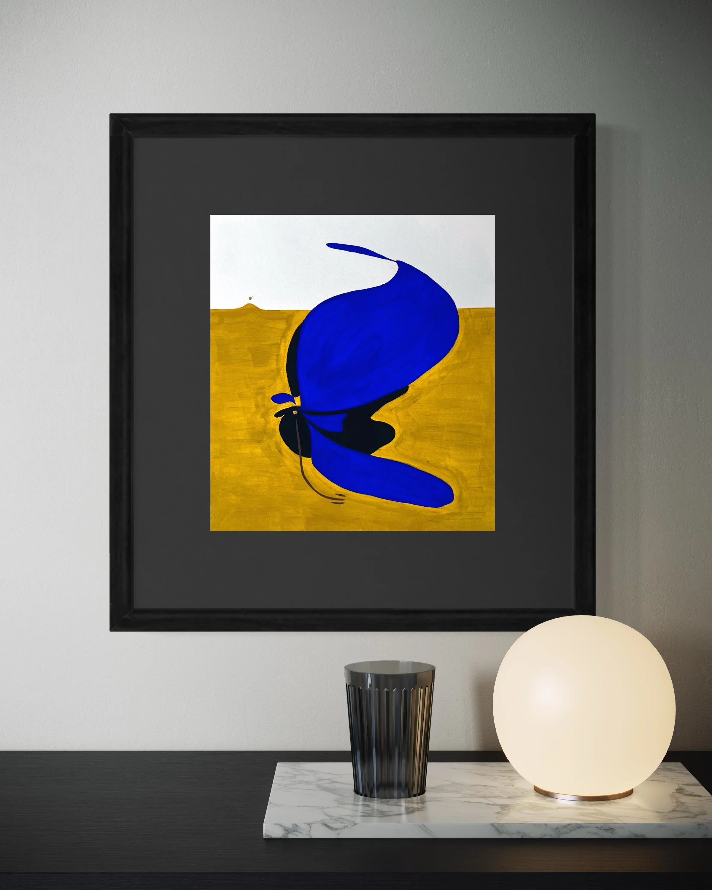
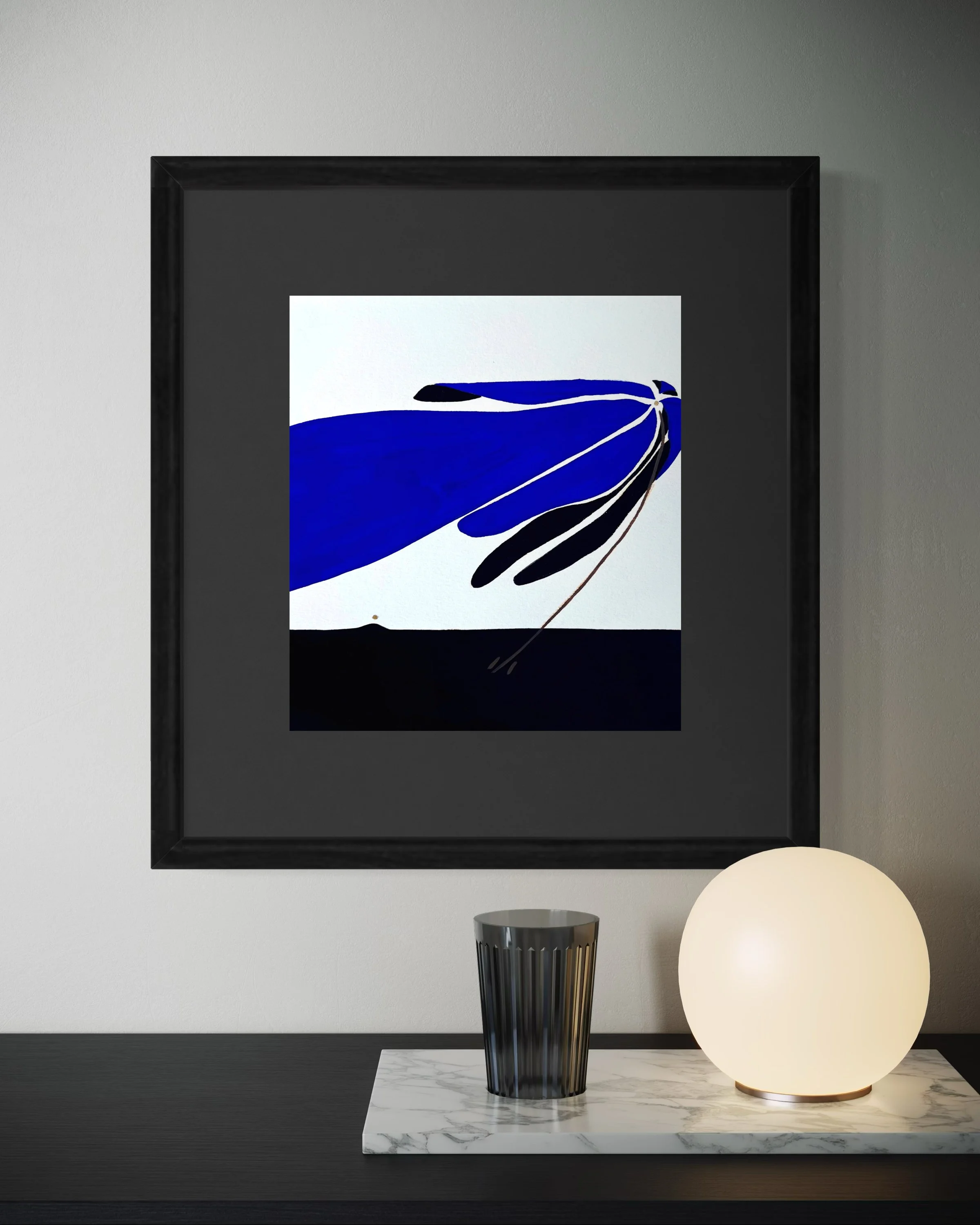
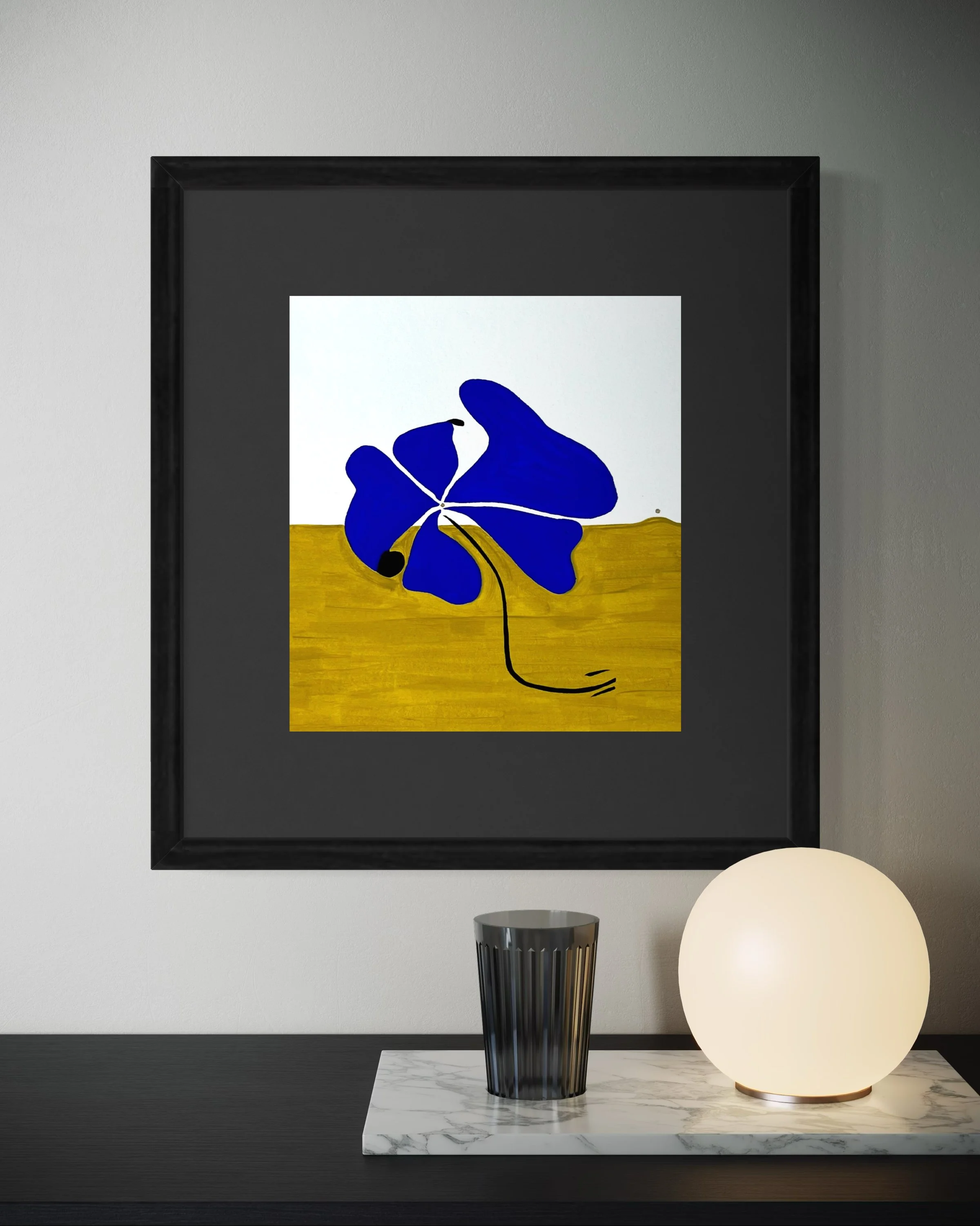
Each painting starts with a pastel drawing of a delicate flower and is then hand-painted in bold colour. The colour signifies the strength we can muster within, regardless of whether we may look or feel fragile. The pastel lines are left unaided as a marker to record progress, to see how far we’ve come, and a reminder of the bigger picture of where we are.
EXHIBITION STATEMENT: TENFOLD

Running Out Of Papers 10 × 9 inches Flashe & 18k gold on paper 2023

Buckle Up 10 × 9 inches Flashe & 18k gold on paper 2023

Airplane Mode 10 × 9 inches Flashe & 18k gold on paper 2023
Miracle Morning 10 × 9 inches Flashe & 18k gold on paper 2023

1618 10 × 9 inches Flashe & 18k gold on paper 2023
Is This What It Feels Like To Feel Like This? 10 × 9 inches Flashe & 18k gold on paper 2023 🔴

Say Hello 10 × 9 inches Flashe & 18k gold on paper 2023 🔴

Pollen 10 × 9 inches Flashe & 18k gold on paper 2023

They Miss The Old Me 10 × 9 inches Flashe & 18k gold on paper 2023

Fresh Air 10 × 9 inches Flashe & 18k gold on paper 2023 🔴