Creative Direction • Art Direction • Branding • UX/UI • Package Design • Marketing Strategy
SING INC.

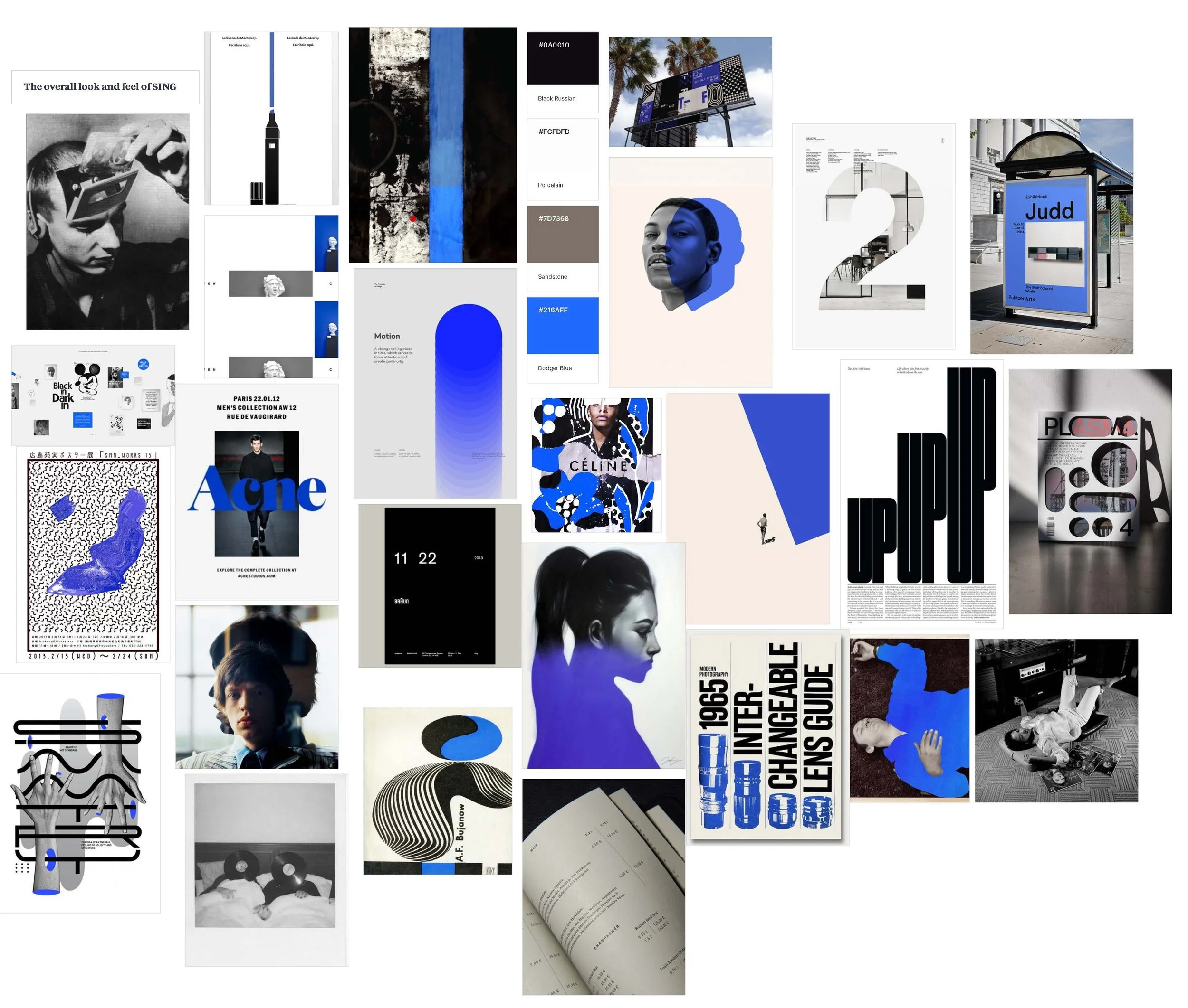
At SING Inc., I led a full rebrand to align the company with its core values of artistry, quality, and authenticity. The new identity spanned album packaging, collector’s editions, UX/UI design, and high-end product experiences, bridging digital and physical touchpoints. I introduced the tagline “Own the Sound” to anchor the brand voice and oversaw all visuals and marketing messaging, ensuring consistency from vinyl releases to social media. Every design decision balanced respect for the artists’ legacies with a contemporary, cohesive presentation. This rebrand positioned SING as a label that honours culture and heritage while resonating with modern audiences.
Creative Direction
SING needed a rebrand that reflected its commitment to artists, quality, and authenticity. I developed the tagline Own the Sound to anchor the brand’s message with clarity and intent. It speaks to both the physical ownership of music and the deeper connection between artists and fans. The goal was to create a visual identity that felt intentional and elevated while staying true to those values. The rebrand also needed to close the gap between digital and physical, making online experiences feel as thoughtful and tactile as a vinyl record. The new identity spans album packaging, digital spaces, and high-end products, honouring the legacy of the artists and their cultural impact while bringing clarity and cohesion.
Branding IDENTITY
logo System
PRIMARY COLOUR-WAYS
1. ON DARK

2. ON OFF-WHITE


SAFE SPACE - FULL LOGO
The full logo should always be surrounded by padding, distancing it from other elements. This padding should be at least half the height of the SING or InClassics logo mark.
When pairing with another logo in association or in a list, the minimum safe space must be adhered to. The full logo should always be surrounded by padding, distancing it from other elements. This padding should be at least half the height of the SING or InClassics logo mark.
When pairing with another logo in association or in a list, the minimum safe space must be adhered to.
The SING logo can be used across a variety of applications while staying true to the brand guidelines.
ADDITIONAL APPLICATIONS

ON IMAGES
When using the logo on top of an image, check for sufficient contrast between the logo and the background image. In most instances, using white or "Off-white" for the logo will help with contrast. Using a subtle dark overlay on the image will also help with legibility. This example obscures the image with "SING black" at 50% opacity.


ON SING BRAND COLOURS
One can use "SING Black" or "Off-white" for the logo when using primary and secondary accents as background colors.


When using a background colour that isn't a SING brand colour (e.g. on a partner's website), the logo can appear in black or white.
ON ALL OTHER BACKGROUND COLOURS

UNACCEPTABLE APPLICATIONS
In an ideal world, the SING logo always adheres to the brand guidelines for legibility and consistency. While not an extensive list, here are some issues to watch out for.
TYPEFACES
HEADLINE & TITLES
Switzer Bold - All caps
body & labels
Switzer - Light

COLOUR

“SING Blue”, “SING Black” and “Off-white” are SING’s signature colors. “SING Black” and “Off-white” ostensibly work as black and white within the design system.
A - PRIMARIES
Tints and Shades
Tints and shades provide contrasting option to the respective colors.
B- SECONDARIES
“Warm Grey” is SING’s secondary color